In keeping with this month’s theme (cos it’s become a theme!) on simplifying a scene, I thought it would be a great idea to do a “close-up” post where we closely examine one pastel painting. Today we’ll look at a piece by Everett Shinn, an artist I’ve only recently discovered.
Everett Shinn (1876-1953), an illustrator-turned artist was, along with artists such as Robert Henri, George Bellows, William Glackens, and Maurice Prendergast, a member of the Ashcan School. Their subject was the harsh life of the poor in an urban setting.
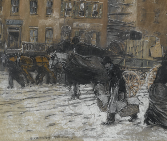
In the painting by Everett Shinn that we’ll examine, his skill at capturing movement as well as the hustle and bustle of life is clearly evident.
Here’s the painting:

What do you think Shinn’s WHY was for this painting? It seems as if it’s about the hustle and bustle and grind of daily life. The darkness suggests overcast weather, perhaps threatening to snow again. People have their heads down and are on the move.
Everett Shinn zoomed in and by cropping, he intensified the crowded feeling of the scene. There’s barely space to breathe! Even the buildings push in on the street.
We don’t know what the original scene looked like and although there are details, we can be sure Shinn acted like the director of a scene in a play, placing everything just so to have the most impact and also leaving out anything that didn’t support his idea.
The big shapes are clear (we’ll get into that below) and his colour palette is severely limited as well as monochromatic in greys, browns, blacks, and whites all of which underscore the drabness of the scene.
To begin our examination of the painting, let’s look at the way Shinn simplified the understructure of the scene into three big shapes. These are shapes of differing values/tones and also of content. Happily, in Shinn’s piece, you’ll see that these two types of shapes (values and narrative) overlap with each other.
First, let’s look at the painting really small. This thumbnail view instantly reveals the three main shapes.

And here is the painting annotated to make it easier to see those shapes. There’s the middle value area made up of the building. There’s the light area which is primarily the ground, and finally there’s the dark shape of the people, horses, and carts.

And, to make the value scheme even clearer, here it is in black and white.

Now let’s look more closely at the parts of Everett Shinn’s painting.
The main figure moves forward with purpose, laden down with baskets in each hand. His boots sink into what remains of the snow on the street. The man’s head visually blends into the background. We discover him by way of his legs against the light snow and the flick of the white cigarette that is revealed in contrast to the dark behind it.

To the far right, Shinn includes part of a woman moving out of the picture. This device – newly favoured by Impressionists such as Edgar Degas who were influenced by Japanese prints for their cropping and point of view – creates a tension between the two figures. It actually animates the painting more than just having the main figure and the horses leaning forward. It also reminds us that we’re only looking at a small section of the whole street and we imagine what else is happening beyond the picture frame. The cropping also adds a feeling of spontaneity, a scene quickly captured in the moment by the artist.

You’ll also see that triangle of middle value to light value that divides the two figures. This helps funnel the viewer’s eye down and then around to the left underfoot. You can see in the next annotated image how our eye moves around and around.

Let’s have a look at a few more details. The head of the horse is shown up against the darker background. Note though that Shinn doesn’t use a heavy hand to apply the white pastel. Instead, he leaves some of the grey paper to show through. By doing this, the horse’s head stays in the background even though we notice it because of the value contrast.

In the background on the left, we spy another figure, this one leading a horse with carriage. We see the shape of the man and horse but there’s little detail. This keeps these figures in the background.

There’s an interesting detail in the background – a space where only partial beams remain. Their horizontal lines are balanced and echoed by the vertical lines of a crate sitting on a cart below, and also, by the vertical lines of the cart itself. This technique brings our eye down (as does the verticality of the walls).

Using words in a painting can be dangerous if the words aren’t obscured in some way. (Dangerous because they may forcefully call our attention away from the main subject). Look at the way Shinn writes the name of the shop very lightly and partially obscures it. We notice the lines as part of the background detail but it doesn’t draw our awareness immediately.

In this next close-up, we have the sign and the wall to its left. You can see how the artist echoes the sign by using a similar colour and shape. This also reduces the impact of the sign on us.

The windows are detailed but they all remain in the middle value i.e. they don’t jump out at us. Also, although each set of windows are the same, Shinn manages to vary them by a few lines and highlight differences which makes them interesting rather than a repetitive bore!

The windows to the far right are at the edge of the painting so the artist barely indicates them. Again, another device for keeping us in the picture!

And finally, Shinn’s treatment of the snow on the street. You can see how he leaves the grey of the paper coming through around the edges of the painting. He applied the pastel more thickly around the main character. This creates value contrast which makes the figure more noticeable. I love the way Everett Shinn indicates the cobbles of the street coming through the snow and the track marks of the carriages. It’s all rather grey and dirty, the way older snow can get with much traffic moving over it.

In the painting, Everett Shinn manages to reveal the essence of the scene by simplifying a complex and chaotic view of street life. He created big shapes of value, he most likely eliminated anything that didn’t work for the piece, and he used a limited palette that keeps us focussed on the action.
Here’s the entire painting again:

I hope you’ve enjoyed this deep dive into this painting of New York by Everett Shinn. Did anything stand out for you? Did you have any ahas? I’d love to know so be sure to leave a comment.
Until next time,
~ Gail
Trending Products


