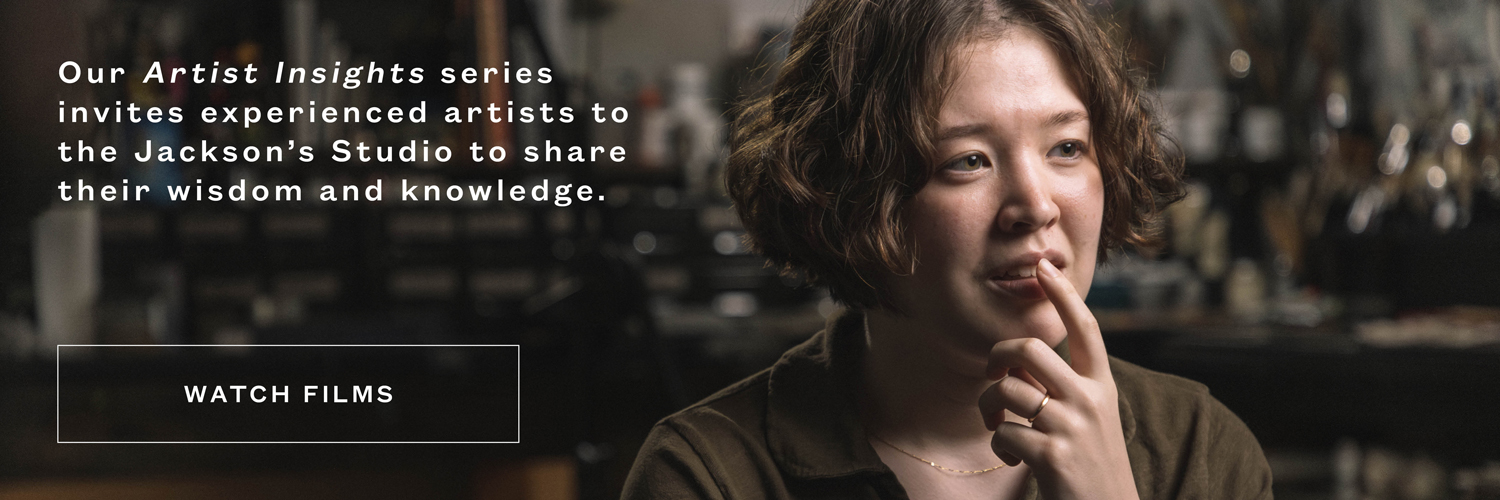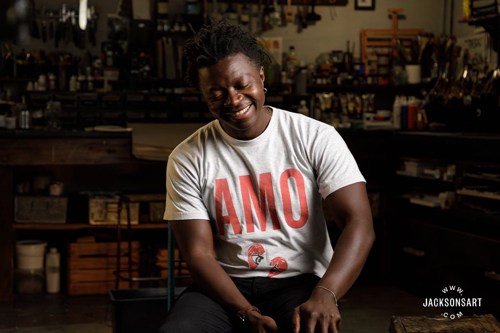
Kay Gasei is a mixed media artist from Southeast London. In this Artist Insights film, Kay explains some of the symbology behind his characters, how different colours hold meaning for him, and why he needs to draw in order to visualise his ideas.
Artist Insights: Kay Gasei
Contents
0.00 Introduction
0.32 “When I was a kid I didn’t know what an artist was”
1.32 “I don’t like to be told what to think or how to think”
2.28 “I taught myself to draw with my right hand”
3.04 “The transition from illustration to painting was reactionary”
3.52 “My work has recurring characters”
7.03 “Words, symbols, and details reverberate throughout my paintings”
7.44 “When you look at someone’s work, you can tell if it’s a pastiche or inspired”
9.20 “I use colour in a symbolic way”
10.15 “I’m always drawing and writing notes”
12.16 “A painting is final when you say its final”
13.10 “I use oils- that’s what the big dogs use!”
16.17 “Brush shape is more important to me than what it’s made of”
17.00 “My studio was clean, once upon a time”
17.40 “I’ve always been a night owl”
19.08 “Titles are sometimes harder than the painting”
19.44 “I rarely sign the front of my paintings”
20.30 “The thing you’re not accustomed to doing, you should do that more”
20.38 Credits

Extract
I didn’t know what the art world was until I was a teenager. At that point, I just wanted to be an illustrator which is what I did in college and at university.
In my second year, I got really outside of the illustration program. I think I’ve been really close to it for ages and only in the last three years or so it has really broadened out – it was very illustrational and drawing heavy and now it’s whatever it is.

When I was young, I didn’t really know about art stuff, just big names of dead people in the national gallery, like da Vinci and Dürer and all the old masters. Anything that was just purely representational. I didn’t have the art education to be able to appreciate modern art so when I started painting I was kind of responding to the stuff that was happening in the world and it was all a little bit political. But I didn’t want it to purely be so, so I think I tried to use a lot of mythology and recent history. So it’s a three-tiered piece and certain details would harken to a mythology or history or the current situation.
It’s just a cool way of telling a story and saying something. I personally don’t like to be told how or what to think. For example, you might watch a film and think it’s about one thing, but there’s a meaning and there’s a theme behind it. So I always try to have multiple meanings and levels to my work. There is a narrative to all my work even if it’s in one image.

Cultural Capital: Appetite, 2023
Kay Gasei
Mixed media on canvas, 200 × 160 cm | 78.7 x 63 in
I work in series quite a lot, usually twos or threes, and I taught myself to draw with my right hand when I was 20. I’m naturally left-handed and I think that added to my practice because it’s not just linear. I taught myself to write backwards as well.
The transitional move from illustration was during the time that should not be named (2020). Illustration work had kind of just dried up, as everything else did, so when I started making work it was almost reaction-based to what was happening.
I was reflecting on Black Lives Matter, so I guess even then it was still a bit autobiographical. I’ve been doing a lot of sketchbook work on identity, masculinity, and what that means. I grew up in Southeast London and I had a very specific idea of what it was.

Luckily I’ve had great friends for the last 16 years and we’ve all grown together and talked about who we are, what we are, and why we are. I don’t know how to put that into my work just yet but some bits are seeping in and my work does have some recurring characters.
I had these characters like the pleasures or the hedonists and I used to draw them to be outlined with curly hair that covered their eyes because they were just like pleasure seekers. But drawing Black Lives Matter stuff, I needed a character to embody how I felt. I couldn’t use that pleasure character, so I just did the opposite, which was a blacked-out character. I filled them in. Because the previous character had curly hair and you couldn’t see their eyes, I made this one have kind of spiky-ish hair, which kind of resembles my hair now, and why a lot of people think it’s autobiographical but it’s not.

S.O.S, 2023
Kay Gasei
Oil, oil pastels and pencil on reverse primed canvas, 120 × 70 cm | 47.2 x 27.6 in
It’s just the opposite of the old character that was a pleasure seeker and this character has diamond-shaped, white eyes that see everything. I didn’t want to use that character too much because I didn’t want to water it down by it being so ubiquitous. But then I wondered why I am giving myself these limitations. So I carried on using the character for different things but then I changed them so the character almost always represents turmoil or something happening to people. Then, if the character has a white body with black hands it’s like divinity. I’m not very spiritual but there’s a thing called meliorism which is the belief in human ingenuity and the spirit of people. So when you see that character with a white body and black hands, it’s the spirit of people in general. Whereas the black character is physical, something in real life, something that’s actually happening.

In the beginning I’d put a blue sock for female energy and a red sock for male energy. I took it away because it felt too highlighted.
If you get it, you get it. If you don’t get it, you don’t get it. You don’t need to be told. I have a character called ‘odd’. It just means the universe and everything in it.
The character is like a child to represent wonder and exploration, growth, and adolescence. Some are super playful and some are a bit more sinister playful. I always want a bit of a haunting element with them. Before they were really detached, but I like the character to represent everyone. I don’t mind having a bit of what I feel in the characters, because I’m not so unique that no one else feels or thinks how I do, so someone will relate somehow.

All Our Sister, 2024
Kay Gasei
Oil, oil pastel and Conte pencil on loose linen, 75 × 105 cm | 29.5 x 41.3 in
There’s a lot of detail and symbolism in my work, which I think comes back to not wanting it to be too obvious.
The titles usually reverberate back to the work like a clue. Everyone’s got their own idiosyncrasies and the viewer can build a narrative with different pieces of my work.
Symbols and details all reverberate back into the work and sometimes it’s just what was on my mind. Sometimes it’s a bit too revealing to use words, and I don’t want it to be like a movie poster. I want it to be an object in the work. I have my personal handwriting which I didn’t want to use before. I used to use a very blocked and simple style. But now I’m more comfortable doing my own cursive script (which is probably illegible) but I think it looks like another object in the work.

R.R ; Chamber Pots, 2024
Kay Gasei
Oil on reverse primed canvas, 90 × 90 cm | 35.4 x 35.4 in
Two of my favourite paintings of all time are Guernica by Picasso because it’s massive and it’s really playful in the execution of it. Obviously, the subject matter is the opposite of playful, it’s a literal tragedy, but I like this antithesis. The other one is Witches Flight by Goya. He’s from a time when artwork was either representational or it was about religion, and this one’s about superstition. It’s weirdly abstract and modern and I think it’s just an amazing image. These witches look like they’re eating someone alive above him, or doing some witchery. It’s super complex, but the image itself looks simple. How do you be the first one to do something is what I get from that one. Some people just copy a style, but something is missing, so you always want to be as bonafide and true to your experience as possible when making work. Once you know why you’re doing it, it will inform how you do it.
My favourite colour is red. From 2021 to the end of 2022-23, I used a lot of red. Now, in the last year, blue is the prominent colour. But red is my favourite, so I don’t care, I’ll just use it. Blue, nice colour, with different shades, tones, and it always looks good. Yellow and green? Something about those colours is not natural to me. I use colour in a symbolic way, like the spirit of an idea. To me, the presence of yellow is like the colour of a spirit for some reason. So in some of my work, you might see a yellow orb, and it’s probably the spirit of the individual.

I’m always drawing and writing notes, but sometimes I get an image in my head that’s been culminating over a long time. Usually when a work is quite simple, that’s how the image came to me and it didn’t really change too much.
I used to design work with my tablet first because I thought I needed to have it planned out. I’d still get some spontaneous elements, but it was always planned. Then one day I just didn’t have time to plan, so I just went straight onto the canvas. I have aphantasia, which means I can’t visualise, and that is probably why I draw so much. For example, a normal person closes their eyes, pictures an apple and can see it in their mind’s eye. I don’t see anything when I close my eyes and try to visualise. It’s just black or just light, unless I daydream, which is not conscious, and my dreams are really vivid. I have to put out an image to know what it looks like. I can’t imagine what it looks like. I used to draw constantly, whereas now I write notes, descriptions, and words. But sketchbooking is the main outlet.

Cultural Capital: Herstory (Claudette Colvin), 2022
Kay Gasei
Oil on reverse primed canvas, 119.4 × 180.3 cm | 47 × 71 in
When I’m painting, depending on where I’ve started from mentally, it can take a few hours of actual physical painting to finish a piece, or it can take months. It really does vary case by case, but for the most part, it’s an average of hours. When I first got into painting I wondered, “What is a painting? How do you know when it’s finished?” Now, it is whatever it is. As soon as I think, “If I touch this anymore, it’s ruined.” I’ve had that thought at least three times. Then I’ll just leave that there alone.
I started using oil because I thought “What did the big dogs use? Oils? I’m just gonna go for that.” I didn’t really think about it, and I’ve never really been a fan of watercolour, I’m not gonna lie. It’s literally wishy-washy. It’s literally watercolour. I just never got into it.
I do use acrylic for an underlayer or just to see the effect, or even acrylic on top of oil just to see what that looks like. The thing about oils is that not many things can work on top of it until it’s really dry. I use turps to thin them, but I don’t want them so thin that they’re like washes. I don’t want washes. So I’ll use some sort of varnish or medium to help it dry, like a siccative, just to bring it along quickly.

For the Birds, 2024
Kay Gasei
Oil, oil sticks and oil pastel on loose linen, 122 × 65 cm | 48 × 25.6 in
Even a glaze, because that helps it become a bit sticky as well. When you put something down, and put something over it, and then it kind of breaks, the effect can be interesting. I’ll also mix a darker colour into the light. Or, I’ll use a little bit of drying medium to help it. I don’t mind the process of using oils in their natural way now.
For the first six months to a year, I used liquin to help the paintings dry. Now, looking back, all the paintings were quite flat. I used siccative or drying mediums, some varnish or glaze.
I’m not a fan of washes. I might do it as a base, maybe just to have some subtle colour in there, especially with the reverse-primed works. But I mainly use Jackson’s oils, as well as Old Holland, Williamsburg, and Michael Harding.
Sometimes I use colour by itself, depending on the mood of the work. Sometimes it’s straight from the tube, but it’s usually mixed, and that’s probably just because of the palettes I use.
I’ve gotten to like cleaning off the palette and then putting all the dry oil in a bucket. With my recent pieces, I thought, “What can I remix? What can I do now?” I usually leave them soaked in spirits or turps, and I get dry bits of coagulated oil paint and use those as my own oil sticks. So they’re already a mixture of colour, and I use them as a base. With my work, for the most part, it’s clear-primed linen or reverse-primed cotton canvas.

Nightmarchers, 2023
Kay Gasei
Giclee print on Hahnmuhle photo rag pearl, 59.4 × 59.4 cm | 23.4 × 23.4 in
I have a lot of brushes – different hairs, different ferrule sizes, all the business. Sometimes I don’t even look at them. I don’t care if they’re synthetics or natural hair, I don’t really look at what they’re made of. I just need the shape because I need the detail. A few of them I’ve edited myself – cut them or pulled out some of the bristles, instead of just using a smaller one.
I have a few that I like – the recurring ones. Probably about 20. Then I have about 50 or 60 others that just sit there like, “Pick me, pick me,” and I’m like, “One day, one day, one day.”

My current studio is a cool space in East Ham. It was clean at one point – once upon a time. And then I got busy and busier, and busier, and it just became madness. I’ve got a shelf with a bunch of books and sketchbooks – too many bloody sketchbooks. Then I’ve got stuff stapled to the wall and a table with all my main stuff on it.
I used to have all the colours set out like a bloody serial killer, with OCD, in the shades. Now, it’s just the mediums and stuff, bits of paper, and moving tables with the colours. I just like it to be as dynamic as possible.
Working-wise, I work at night, always have. Even as a kid, I always used to stay up and draw. Because during the day, I was in school, and then came home to do chores and family stuff. But at night, I wanted to draw – everyone else was sleeping, and I had my space.
So, I used to stay up and draw underneath the covers until a stupid hour. It probably wasn’t even that late, just past midnight, but it felt like a rebellion. As an adult, I tried to be a ‘normal’ civilian, go to the studio at 9 am, make a cup of coffee, and do the usual. But I’d find that I’d do nothing all day, then at 5 pm, I’d feel inspired. So I’ve just leaned into it. Nighttime is the best time for me – at least evening.
Now, during the day in the studio, I do sketchbook work or preparation work. Then, I leave at a reasonable time, maybe take a day or two off to live life, then go back into the studio. I’ll be there from maybe 5 or 6 pm until 5 or 6 am, or 3 or 4 am, however long I think I need. I lose track of time. It’s what it is.

The Malaika Fight The Flesh, 2023
Kay Gasei
Oil on linen, 150 × 80 cm | 59.1 × 31.5 in
Thinking of the title is harder than the painting itself, to be honest. Because the title, for the most part, is related back to the piece or is another inkling into what the piece is about.
And sometimes I don’t know. I don’t like the idea of ‘untitled’. It never sat well with me. If a painting is physically done and I haven’t got a title for it yet, then it’s not finished in my head. The title is part of the piece to me.
If the work feels like one of these deep and meaningful works where I’m really getting my heart and soul into it, I won’t sign the front of it because I feel like it detracts. My signature could just look like an object somewhere else. I know it’s mine, but I don’t want it to be a product. I don’t want it to feel like a product – like, “Oh, buy this.” The image should speak for itself.
So, I rarely ever sign the front. Maybe on the side or the back. It’s weird because I make it to sell it, that’s the point. But I try not to have that in mind when I’m making it. I just try and make something I want to make.

In the words of my brother, “People buy into you, not really your work. I don’t know about this painting stuff, but you’re probably right – it’s you more than the work.”
Obviously, the work is the work – that’s great but don’t hide, just meet people, go to the shows, and all that kind of stuff. The thing you’re not naturally accustomed to doing, you should probably do that more, because the thing that you can do, you’ll be comfortable to do it. So if you are one of those shy people, who don’t go to shows and don’t meet people, you should probably make sure that you go, even more so. Just do it. Just buy some materials, and just do it. Think about why you are making the work, and, if you don’t really have the why, because sometimes you don’t have the why, you just say “I just want to make work” and go with your intuition. Your intuition should inform the process.
About Kay Gasei
Kay Gasei is a dynamic visual artist whose work explores the intersection of symbolism, abstraction, and surrealism. Drawing inspiration from mythology, dreams, and the human experience, Kay creates thought-provoking pieces that challenge perception and invite deep introspection. His unique style blends intricate details with powerful storytelling, making him a rising force in the contemporary art world.
Kay Gasei is a Zambian-British, London raised artist whose artistic journey has been one of transitions from illustration, fashion and through to the quote unquote fine arts most recently. His works focus on a range of topics with a style that tends to elude to rather than overtly elucidate, working with multi and overlapping narratives. A dynamic visual style whose work explores the intersection of symbolism, abstraction, and surrealism. Drawing inspiration from mythology, dreams, and the human experience, Kay creates thought-provoking pieces that try at challenging perception and invite a twinkle of introspection or just to let the mind wander.
Further Reading
Inside the Sketchbook of Kay Gasei
The Accidental Invention of Pyrrole Red, a Modern Pigment
The Mental Health Benefits of Creating Art
Plein Air Painting at Glastonbury Festival
Shop Oil Painting on jacksonsart.com
Trending Products
