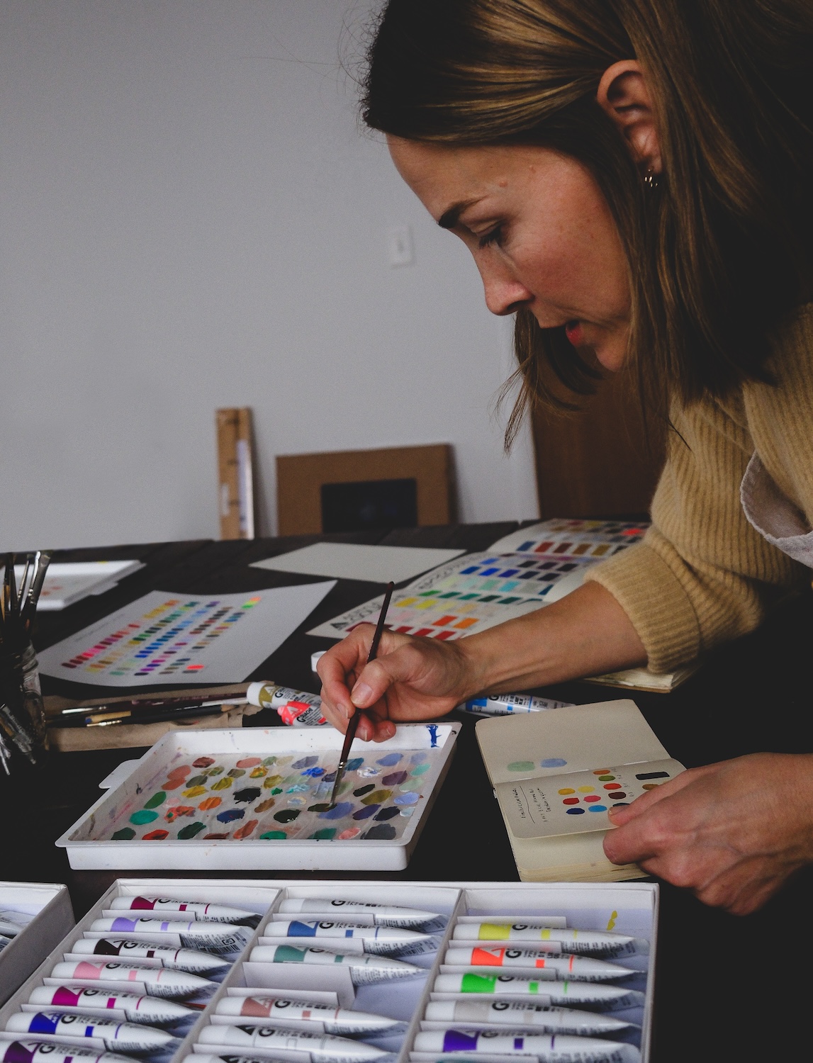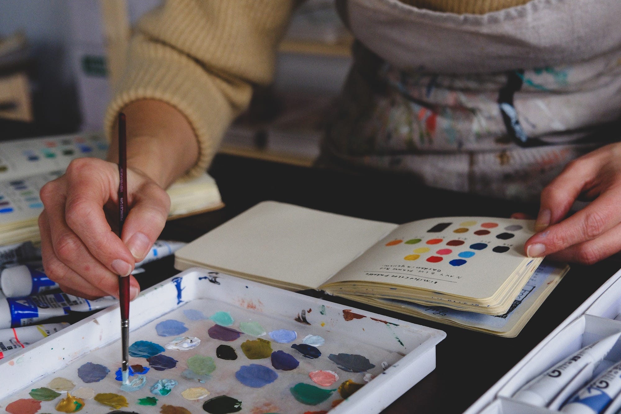
Rebecca Green is an author and illustrator who has collaborated with Holbein to create a unique set of 12 Holbein Acrylic Gouache paints. Here, Rebecca explains how she selected the colours in this collection, what the palette could be used for, and how she imagines artists using the box set.
Rebecca Green Holbein Acrylic Gouache Set
by Rebecca Green
In 2021, I had the privilege of collaborating with Holbein on a 12 Colour Set of Acrylic Gouache paints. I’d been using acrylic gouache for years and serendipitously my husband and I moved to Osaka, Japan where the company is based. I was lucky enough to visit the Holbein headquarters, get a tour of the factory, and learn about the production of their art supplies. That in itself was a dream, but being asked to curate a box set and illustrate the cover was such an honour.
Acrylic Gouache is similar to Traditional Gouache in that the end result is a matt opaque paint. The big difference between them, however, is that Acrylic Gouache does not reactivate with water as Traditional Gouache does. In line with acrylic paints, it sets once it’s dry. This is due to the binder. Both Watercolour and Traditional Gouache contain Gum Arabic as their binder. Acrylic Gouache has the same binder as Acrylics – an Acrylic Emulsion.
A simplified explanation from Holbein:
Watercolour: Pigments + Gum Arabic
Traditional Gouache: Pigments + Gum Arabic
Acrylic Gouache: Pigments + Acrylic Emulsion
I love this paint because of its versatility. It can be thinned with water and used in a transparent manner, it works well in flat graphic blocks of colour, and it’s also beautiful when mixed and applied in a lush textured fashion. Furthermore, it dries super fast and can be layered endlessly without re-wetting. It works well on a variety of papers as well – most often I use it on Bristol Paper or Hot Press Watercolour Paper.
Because I’d used Holbein Acrylic Gouache for so long, it felt quite surreal to be curating a box set. To begin, I needed to choose 12 colours. I immediately picked out the colours that I reach for over and over again – Ash Yellow, Coral Red, and Sepia. While I knew those would definitely be included, choosing the others required a bit more deliberation. Luckily for me, there were 99 more colours to choose from! I went down to the Holbein Gallery and Showroom in Osaka and went through their complete box set of 102 colours.
The goal for this set was to choose colours that would be useful to artists whether they were trying this type of paint for the first time, or if they’d had many tubes of acrylic gouache already. If the artist had never used these paints, I wanted the set to be an option as a starter set (assuming they add a primary black and white). If the artist already owned the primary set, I considered this one to provide an additional range of colours to build upon those primaries. Furthermore, if the artist was already accustomed to using acrylic gouache, they might benefit from beautiful vibrant colours like Emerald and Gold.
When I was choosing the palette, I reached out to two other illustrators who frequently use Acrylic Gouache, Flora Waycott and Joe Anderson, and they were super helpful in giving me feedback. It was super important to me that the box sets were not only beautiful but practical and helpful too.
The colours of course, also had to reflect my own taste. Colour has always been a natural part of the process for me. Beyond high school art class, I haven’t taken technical colour theory lessons, but have worked intuitively, building skill through practice. I tend to choose limited palettes in muted earthy hues with hints of vibrancy throughout. My subjects include costumed animals, simple magical scenes, and narrative picture book paintings – all with an overall warmth and age to them.
In choosing colour palettes for my work, I usually reach for a small range of primaries – not your typical magenta/cyan/yellow but perhaps a Coral Red, Ash Blue, and Ash Yellow. This gives me a wide range of possibilities but keeps my work harmonious and balanced. With this set, I had the same thing in mind – to provide possibilities with a range of primaries, but ones that reflected my work.
In the set you’ll find two reds – Vermillion and Coral Red, three blues – Smalt Blue, Pale Aqua, and Ash Blue, and two yellows – Mustard and Ash Yellow. There are also two greens – Sap Green and Emerald, and three browns – Burnt Sienna, Sepia, and Gold. While green is technically a secondary colour and can be made from blue and yellow, I often use green in place of blue for my palettes and really enjoy colours like Emerald which can be difficult to create with just primary cyan and yellow.
The two colours I most deliberated on were Mustard and Sky Blue. I actually use more Yellow Ochre in my work but decided against choosing it because I thought most people would have it, and I also thought the brightness of Mustard would lend to more mixing potential. Sky Blue lost out to Pale Aqua because I wanted something you could mute down easily for a beautiful cloudy sky. If I had to add anything to the paint set, say if there was room for a 13th option, I’d definitely add Luminous Red. An artist I met in Japan, Lisa Oki, recommended this colour when I lived there and it changed my work. It’s neon, which is not something I typically go for but it has a tremendous ability to warm paintings up and make them glow. And of course, as I mentioned this set does not come with black or white. If I had to recommend those, I’d recommend Jet Black and Super Opaque White.
Most of my paintings are created with muted colours and this set provides ample opportunity for that. Some of my favourite muted colour combinations from this set include:
- Adding a bit of Vermillion into the Sap Green for a lovely hunter green hue.
- Adding a bit of Coral Red and White to Emerald for an aged green.
- Adding a touch of Burnt Sienna into Pale Aqua for a lovely old steel colour.
Alongside muted hues, I always love to have a vibrant or special colour as well, and this is where Emerald Green, Smalt Blue, and Vermillion really shine. They are lovely straight out of the tube or dashed around the painting in deliberate places. For the addition of warmth, I included Burnt Sienna and Sepia. I never use black to mix with my palettes, unless it’s a dominant and purposeful colour, but instead use Sepia. It’s a dark brown with the power to create dark darks, but it also carries the element of warmth. Burnt Sienna is also such a lovely warm colour and can be used to make a range of browns and neutrals.
While I’d love to think that this set works for all painting needs, it’s best suited for painting water scenes, landscapes, animals, and objects. You could paint portraits with it too, I definitely have. As I mentioned, you’ll want to purchase a Primary White or Super Opaque White to have an even bigger range of options. From there, the possibilities are vast. The gold is a special addition that I think works beautifully on fine art that is seen in person. While it can be difficult to scan, it’s really something special to see it on an actual painting.
To create the box set illustration, I tested out options and realised that using all twelve in one painting was a bit overwhelming. Instead, I chose to narrow it down and used Emerald Green, Burnt Sienna, Sepia, Vermillion, Mustard, and Coral Red, along with the addition of Super Opaque White. There is a paper insert into the box set which includes three more small examples of limited palette options within the box too.
The limited edition box set came out in 2021 and sold out almost immediately. Holbein did another run of the sets and those too sold out. I was thrilled to hear that they decided to make the set available again, in larger quantities. Aside from the small change in our logos, the set is the same special one we created together in the beginning. I am grateful to Holbein for entrusting me with this collaboration. I continue to use their paints daily, and I’m thankful we connected and that we can share in this venture to create opportunities for artists to create.
About Rebecca Green
Rebecca Green is an American author and illustrator working primarily in picture books. Her work is created using an array of analogue techniques, though she is most comfortable with gouache (both traditional and acrylic), graphite, and coloured pencil. Her illustrations focus on themes of nostalgia, celebration, and companionship. Green is currently working on a book series with Tundra/Penguin Random House, set for release in 2026.
Further Reading
Sarah Dyer Curates Sets of Jackson’s Handmade Soft Pastels
Acrylic Painting for Beginners – What You Need to Get Started
Review of Holbein Artists’ Watercolour Paint Set of 30
Shop the Rebecca Green Holbein Acrylic Gouache Set on jacksonsart.com
Trending Products
